|
Notes by Roy: This tutorial used to be a single image with the notes being mixed together with the drawing steps. I re-typed it and only fixed some of the spelling and grammatical errors to avoid the loss of TH's own writing style. English is obviously not his first language (likewise for me :)), but I think that it is understandable nevertheless. You can download the original tutorial image here.
TH/ACiD Productions:
A) Eat this, buds... while the others are concentrating on TrueType logo collections, its better give you guys a tutorial of penciling logos. I start my logos using a normal handwriting style and a random use of upper & lower case letters (like a & A used here) to make the style different each time.
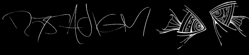
B) I use normal A4-sized papers because of a lot of details (Note by Roy: Standard US Letter will also do just fine :)).
Some lines are added to make this logo 3d... also rubbed and fixed some areas as I wanted them to be... I don't like spaces between letters so I "joined them together" with rubbing the lines in some parts of letters. At this stage I started to draw the outmost lines with ink.
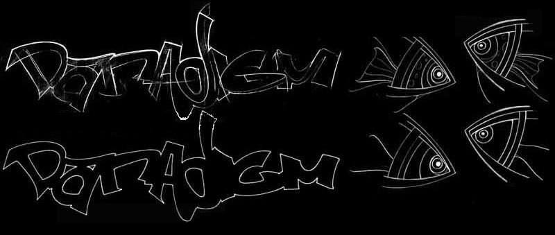
C) Now the outer lines and the inner areas that are the most important are inked. In this stage I also cut all pencil lines out with rubber...

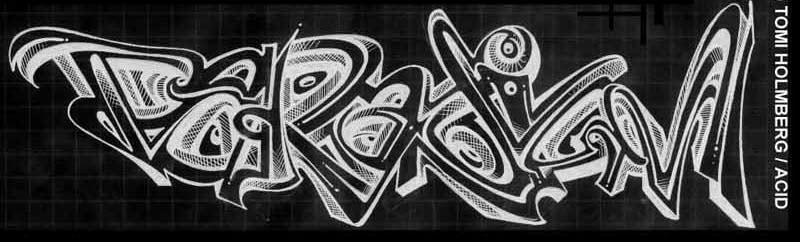
D) Here I add some simple 3d-shades for letters. I have no rules how they should be done. Without pre-lines with pencil the result is more complicated as you might see that the shades in second "A" letter went fucked up - I have to do other things to mix that part to look cool. Now I also start to do the inner lines and correct some of the outer lines.
This is the easiest stage to spoil the logo for myself =) I use different lines in inner spaces of letters to make the logo more personal styled and 3d... I use also pencil here to back up the ink lines. The filling of different lines in this part takes most of the time (something like 90%) I use for logos.

E) I use crossed lines as a shading method for some inner parts to get some depth. The logo is finished but needs still something...

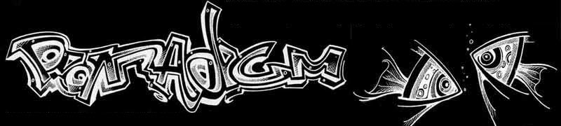
F) I added a line below the logo to balance the size differences of the single letters. Also some little "spots" are added just how I like them with some more lines. The finished work is the 1st logo in this tutorial.
The method of creating things & imaging objects (seeing them developing piece by piece with lines) used in fish is very personal ... It's a lot difficult to do that kind of stuff than to see for example how this logo is done without seeing the steps first. It might (and won't) give you nothing but ideas because the development of the way to see things differently takes hundreds of hours of drawing... Its same in art schools - sure they teach you the right perspective and stuffs but not how to see... never rip anything - neither it's fucking low, but it also just fucks up your creativity in same time as others are millions of times ahead of you because they have some new things to offer.. ..
|