Table of Contents
              "**??bo.
     ,'            '*?8b.
   ,d8b                ?8b
 ,d8888   " ASCII art   "?b.
 d88887  is no less       'b
 88888     than one more   8
 88888    ARTform "        8
 88888                    :8
d88888bo,._  js  _,.od888b:8b
8Y888888888b    d88P88888P:88
8:888' Y8P88    Y7" Y8P'  :78
8j887     88    ::.        :8
YY88:    ;88      '':..    dP
:!88b   ,d8P              :8;
  888b,d88P'              ;8
  Y8888888Ln,__,n.        d8
  :8888888888888888b    ,88P
   Y8888888888888888b   d88;
   :888888P"''''''Y88b,d88P
    "Y888888888888888888P"
      "Y88888888888888P" js
        '"*?88888?*"'
- Introduction
- What is solid ASCII?
- What you need
- ASCII art software
- Choosing a font
- The basics
- Sketching
- Antialiasing
- Straight lines
- Drawing like a pro
- Working with different fillers
- Carving negative space
- Color!
- Publishing your ASCII art
- Text file formats
- Make yourself known
- About this tutorial
1. Introduction
For some reason, people tend to think ASCII art requires an insane amount of talent or patience. Many associate it with boredom rather than artistic expression. I've heard about "the old times of ASCII art", even though this
artform is far from dying.
It's too hard to get rid of such misconceptions through simple words. You won't know what ASCII art is like until you try, and then you will discover that it's no less than one more artform. It's performed by people like you and me, with lifes, schedules, and, above all, skills of their own.
This tutorial will show you some methods to draw ASCII art, focusing in "solid style ASCII". I hope to make it easier for you to find your personal style, subjects and your way through the unlimited possibilities of ASCII. And this tutorial doesn't target only wannabe ASCII artists. By showing my way to ASCII, I also want the general public to understand how easy and fun it can be. Well, enough of my speech, let's make ASCII art!
Julio Sepia
ASCII artist since 2005
1a. What is solid ASCII?
,od8888bn. ,.od88bo,
d8P┤ `*88bn. , `Y8b
88┤ `*888b. `D8
Y8b ,`*Y8bn. ,d8P
`*Y8bn,. À `*+88888P*┤
Infinity js
Solid is a common style in ASCII art, where the pictures are composed of filled, consistant shapes. The "infinity" symbol represented here is an example of solid ASCII art. Solid pictures are flat and thick. There is no shading
involved, and there are rarely any thin lines.
In solid style, there's usually an unique character to fill the larger areas (a filler), and complementary characters on the edges to create the anti-aliasing.
Solid style ASCII doesn't suit well for small, detailed pictures, but it's perfect for logos, large silhouettes and highly contrasted pictures.
2. What you need
ASCII art can be done almost anywhere, and with a minimal amount of tools. It's considered the most universal digital artform. However, some of these tools are more fitting for ASCII art or for your style. Some of the links may not work, but you can still locate any of these programs and fonts through Google.
2a. ASCII art software
I'm not talking about converters, of course. If you're reading an ASCII art tutorial, you probably want to learn how to do nice and clean images rather than messy conversions. Here you will find programs for MS-DOS, Windows, Linux and Mac. Other platforms often include their own text editors anyway.
- Windows Notepad is a really simple text editor, but it does a good job for small pictures and doodling. It doesn't have the tools and features you will find in a dedicated ASCII art editor, but what's good about it is that you'll find it in any Windows system. Because of its simpleness, Notepad is both a good start for beginners, and a good challenge for experienced ASCII artists.
Similar programs: MS-DOS Edit, Notepad++, Wordpad, KWrite and almost any text editor out there.
- ACiDDraw is a very good tool to create textmode art (both ASCII and ANSI). It works on MS-DOS and you have to navigate the menu through the keyboard, but you can still use the mouse to draw. It supports many file formats (ANS, ASC, BIN, etc). Your "canvas" can be up to 160 columns wide and 1000 lines high!
Similar programs: TheDraw (MS-DOS, predecessor of ACiDDraw), Duh Draw (for Linux), TetraDraw (for *nix systems).
- PabloDraw, a.k.a. Pablo, is an ASCII/ANSI editor for Windows. It can emulate MS-DOS
80x25 font (the most common one), the old 80x50 and even Amiga font (a.k.a. Topaz). These three fonts look very good for solid style. Like any textmode art editor, it has tools to cut, copy, move and fill areas. It also has an interesting "collaboration mode", in which several artists can chat and work in the same picture through the net. It can work in .txt, .ans, .asc and .bin format, saving regular backups (lots of them). It saves .ans files by default, be sure to include the .txt extension if you just want a text file. It's pretty fast and reliable. Good for the "old school" look. The only drawback is that you still depend on other programs to save your ASCII art in image files.
No similar programs. ;)
- JavE is quite popular. Many people define it as "the Photoshop of the ASCII world". It's far more than a text editor, it has many "undo" levels and it can export your ASCII as an image file. The amount of tools is insane, and goes from the usual brush and fill tools, to 3D modeling and and a converter (that is just as crappy as any other converter). Its textmode edition abilities aren't too different from other editors. The tools are useful for sketches and preview drawings, but they're far from what you can do by hand.
Similar programs: ASCII Art Studio (shareware), Email Effects (shareware, available for Mac and
Windows)
I mention these as useful programs for ASCII art. I've tried many, and I'm discarding Ansipaint for its lack of usability, as well as most programming-oriented text editors.
2b. Choosing a font
First of all, you need to use a fixed-width font (or "monospaced" font, it's the same thing). Don't let anyone tell you otherwise. A fixed-width font is a font where all the characters have the same width. The reason why ASCII is
always done in fixed width is so that everyone can view it in a similar way. If you make a drawing in Arial, it will look deformed in Times New Roman and completely messed up in Courier.
Most ASCII editors have a limited handful of fonts you can choose from, but you can always open the file in Notepad to take a screenshot with the font you like. Here's a list of fixed width fonts you
can choose:

Courier / Courier New is a very common font. It comes with Windows, Mac and most Linux distributions. It's the default fixed-width font in most browsers. It doesn't suit very well for large scale ASCII, because it's wide and thin, but the shape of the characters allow for a good antialiasing.
Mono is a generic font used by some Unix and Linux systems as their default fixed-width font. It's also called Monospace. It's your typical typewriter-like font, very similar to Courier.
Lucida Console comes with Windows 98 and above. It's very thin and doesn't suit for most solid pictures because of its lack of contrast.
Fixedsys is a bitmap font included in Windows. It's a strong and thick font, a good choice for solid ASCII art, but less nice for other styles of ASCII.
MS-DOS 80x25 font is also a good choice. It's the font used for most newskool ASCII and ANSI. You can't use it as an actual font in Windows, but you can still use PabloDraw to emulate it.
Terminal comes with some Windows programs and there's a Linux version too. It's similar to MS-DOS 80x25, but smaller. This one can be used as a Windows font , but it's a bitmap font, so it shouldn't be resized.
Topaz / Topaz New is the font used in Amiga computers, and it's great to draw solid ASCII art, despite being very tall. There's almost no line spacing, but that's not a problem. It's bundled into PabloDraw and JavE, and you can easily download Topaz New from the net to use it in other programs (just google for it).
If you're trying a new font, make experiments with it. Draw some simple shapes and see how the characters look like. You will probably have to change or adapt your style from one font to another. Look at this example:
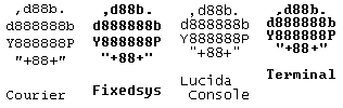
The circle on the far left was drawn in Courier New. The same circle looks much darker in Fixedsys, and the bottom part is less round because the '+' sign is smaller. The same circle looks flat and jagged in Lucida Console because the '+' sign is too low compared to the quotation marks. It looks more flat in Terminal, even though the proportions between the characters are similar to Courier.
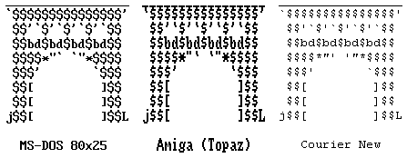
Some characters look the same in different font, some others vary a lot, for example, the dollar sign, the apostrophe, accents and quotation marks, the 'plus' sign, and above all, the asterisk. The arch above was initially draw in 80x25 font and it looks fine like that. Its height doesn't change when viewed in Topaz, but the apostrophes and accents are bigger than the quotation marks this time, and this breaks the smoothness. The asterisk is much bigger and the dollar sign doesn't work well. In Courier, the asterisk is too small and the apostrophe is straight. Forget about using dollar signs in Courier.
See the antialiasing section and working with different fillers for more information about choosing proper characters in different situations.
3. The basics
Many people look at ASCII art and just wonder "where do I start?". That's easy. Open Notepad or your favourite text editor and start making ASCII. Yes, with a keyboard. There is no better way. There is no reason to be
scared. Your first doodles will probably not make any sense, but Da Vinci's first drawing wasn't a masterpiece either. As long as you start, that's good. The rest of the tutorial will explain you how to draw solid ASCII from the basic sketch to the most advanced techniques. But before going to the specifics, you should keep these advices in mind:
 d 8 b             ,
 8 8 8            d8
 8 8 8           j88
 Y888P           888
  "8"            888
   8   Drawing   888
   8   everyday   88
  ;8:   objects   88
  j8L  is a good  88
  888   way to    88
  888    begin.   88
  *8*             YP
If you use a more complex program than Notepad, you may want to try the options and menus, so that you know your program well before starting. Try to select, move and flip text in PabloDraw or to doodle with the brush in Email
Effects. This way you won't be distracted by these options later. It's a good idea to open an ASCII picture created by an experienced artist, look at how it is done, erase some characters
and re-draw them in "your style", add some additional objects to the picture and so on. This tutorial is about solid style, so don't use too much detail, try to get the general shape. Don't hesitate to redraw your picture in a higher resolution if you feel like it's too small.
Try drawing with references, too. You can take an everyday object such as a computer mouse, a bottle or an animal, and wonder how it would look like in ASCII. JavE has a "watermark"
tool in which you can set a background picture and draw over it. That can be a good way to learn, even though you should eventually improve and learn to use a reference without drawing over it. Or even better, create your own pictures from scratch.
3a. Sketching
Not many ASCII artists make "sketches" prior to drawing, but it can be useful to do it, especially if you're attempting a large drawing. During this stage, you use one single character to get a basic shape drawn. You will be able to smooth the picture later. But first, you must choose that unique character to fill the picture, the filler character. Here is a list of the most common filler characters and the way you should use them.
- 8 (eight) is a common filler. It can be used in almost any font, with similar results. It covers the medium and upper area of the line. It suits for almost every picture, especially round shapes.
- $ (dollar) is used mostly by demosceners. It's symmetrical and it covers a larger area than 8 because of the upper and lower marks. It's not a good choice if you're not working in MS-DOS font.
- S looks nice in most fonts, especially Courier. It can also be used with $ (dollar) in MS-DOS font, to create shading.
- H is quite good, it works in almost any font. It's usually darker than the other characters. It doesn't suit for animals, portraits or other round shapes, but it's still good for "square" subjects like buildings and furniture.
- @ (at) is often used by converters. It's not a good choice in general. Its shapes varies a lot: in Courier it's round and thin, but in MS-DOS it's narrow and thick.
- % (percent) doesn't work well in most fonts, but you can use it in MS-DOS font for a different level of shading. It's usually weaker than the other characters, so you have to antialiase it in a different way.
- : (colon) is light and small, it works the same way in most fonts, but the picture can be hard to view if you use it as a filler. You can still use it to add a different level of shading, same as for the "percent" sign. See working with different fillers to understand how to handle it.
- # (crosshatch) is very dark and compact in most fonts. Because of this, it enhances the line spacing rather than creating an uniform texture. Try to use H instead, unless you need a very, very dark filler.
- M / W are very common, but they're not symmetrical, so they can create undesired "lines" or "gradients" when the picture is viewed from close. There are better choices.
- N looks good in Courier and Lucida Console, it can be a lighter alternative to M. But in some fonts, the diagonal line only reaches the middle of the letter, and the results aren't nice. Z is similar and it doesn't have that problem, but it's not commonly used.
- X can be nice. It's a medium or dark filler depending on the font.
- I and | (pipe) are almost identical in some sans-serif fonts, but you can differentiate the letter I in serif fonts because it has "feet". See what they look like in your font. They can be useful to create a "striped" texture, but don't use them otherwise.
Other than that, you can find your own fillers. Try to avoid non-symmetrical characters unless you're looking for a specific effect or texture. If you can't decide, choose 8, it always looks good. Now that you have a filler character, you can start drawing (yay!).
          8
         888
       8888
      88888
     888888
     888888
     888888
      8888888
          8
8888888888888888888
  8888888888888888

  Basic sketch
   of a ship
Try to have a basic idea in mind. You can make a previous sketch in paper if it feels too hard to start from scratch. Put some characters on the canvas. You can throw some scattered characters and then start refining and filling the shape. The example here shows how I would start an ASCII sketch. I usually start antialiasing along with the sketching, but this time I will sketch the whole picture before moving on to the next step. You can choose the way that feels more comfortable to you. I'll start with a ship because it's simple.
It looks rather jagged and very unrefined, don't you think? What can we do to make it smoother? Well, here comes the trickiest, but most fascinating technique of ASCII art.
3b. Antialiasing
      8888                       ,od88P
   888888                       d8888P
  88888888888888888      8     j88888888888888boo.    b
  888888888888888888888  8     68888888888P***Y8888b. Y:
  88888888            88 88    Y88888P'          `*88bdb
    8888    8888888     888     `8888   ,d88888bo, `*888
    8888  8888888888888  8      ;8?88b,d88888888888b )P'
   88888888      88 8888        j8|8888P'    `YP`Y88b'
  8888888        8  8888        88:887'        " `88P
  888888             88        ;88 88             YP'
  8888888             8        j88 88b            `L
  88888888                     688 888bo.          Y
  88888888888                  888 888888>         `
  8888888888      8888         "*'j88888P    d8888P'
  888888888               =>    od888889      `"P'
  88888888     88888            8888888'    ,od8b,
  8888888                       888888P         ``
  88888                   =>    8888"V
  888888                        8888b,
  88888888                      888888b,
  88888888888                   `888888888bo,,
  88888888888888888              88888888888888P"'
  88888888888888888             j88888888888888L
 888888888888888888            d8888888888888888b js
Antialiasing plays a crucial role in most low-resolution artforms (not only ASCII art, but ANSI and pixel art as well). The example here shows how that silhouette made of 8's turns into a sharper moai-ish figure.
Antialiasing is to add additional characters to make the outlines smoother. An antialiased picture has more accurate borders than a picture made of a single character. Antialiasing allows you to add more detail and create more
interesting shapes.
The following chapters will be focused on how to get a better antialiasing, so be patient. Don't get lost trying to use as many characters as possible, it's better to have a simple palette of no more than ten characters, and then make changes as needed. The key is to understand the characters and their shapes, then place them as needed.
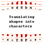
This is my technique. When you're working in textmode, there's an imaginary grid of columns and rows in which you type characters, right? As you type, try to go visualizing the shape you will try to fit into that grid. Take into
account details such as how high or low the characters are, how slanted you want the lines to be. Evaluate each space in the canvas and then translate the desired shape to the most fitting character. In this diagram, the upper rows
show the desired shapes, and the lower rows show some antialiasing characters you can use. There are many more choices, and you will probably find better antialiasing characters than me. It's a matter of style.
Some people draw an actual grid over a reference picture, and then translate the characters one by one in a text editor. Most of the time, you won't need a grid for that, you can do it directly from your mind. It probably sounds
time-consuming or plain impossible, but it's enough to remember that graphic I showed you. After a few minutes, antialiasing should come naturally to you. You usually don't spend more than one second thinking bout the appropriate
characters to place. However, there are some tricky situations.
P works well for most lower right curves and so do 7 and F, but there are no similar characters for the left side (q is too low). Y is closer.
Some people use + (plus) too, or even < and >. V is not that good for that, its shape varies a lot. b and d are good in solid ASCII, but they will probably look dark if you use a light filler. It's the kind of things you should take into account when you're antialiasing. The rest of the tutorial will mention these issues in detail. Let's make some ASCII then.
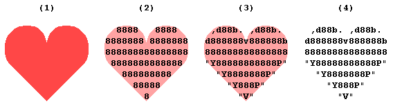
Let's say we want to draw a heart (aww). We start by visualizing the heart into the picture (1). Use your imagination and draw a sketch accordingly (2). You can use a brush tool or just type, after all, it's a sketch. Now we move on to the antialiasing (3). Notice how the 8's have been replaced by big characters like b, d, P and Y. The rest of the lines were smoothed by adding quotation
marks, commas and dots. Commas are nice because they go with the flow of the line, but there's no equivalent for the right side, so we use dots instead. I didn't want to use accents instead of quotation marks because they look almost invisible in Courier. The final touch is a v to represent the crease in the middle of the heart. We have here a nice and simple ASCII done in less than a couple of minutes (4).
3c. Straight lines
After a short while of creating ASCII, the basic shapes should come to you naturally, without the need to think a lot about how to get the proper antialiasing. For example, straight diagonal slopes. It is suggested that you
use this chapter as a reference, rather than something you have to learn by heart. You can even skip it to make the reading easier.
   d88888888 88888888b
  d888888888 888888888b
 d8888888888 8888888888b
d88888888888 88888888888b
   j88888888 88888888L
  j888888888 888888888L
 j8888888888 8888888888L
j88888888888 88888888888L
Two ways to create antialiasing on upper slanted slopes. Just as easy as that. The first one works well in most fonts, but the result isn't always optimal. The second one is best for MS-DOS font, but as you can see, it doesn't
look that good in Courier. Anyway, the process is the same: we work by placing the right antialiasing characters in a diagonal pattern.
Y88888888888 88888888888P
 Y8888888888 8888888888P
  Y888888888 888888888P
   Y88888888 88888888P
\88888888888 88888888888F
 \8888888888 8888888888F
  \888888888 888888888F
   \88888888 88888888F
The same is done for lower lines. P is a common choice for the right side and F works too. However, the left side is problematic. Y is the best we can find, but sometimes \ (slash) can fit well enough (if you don't mind the hard border it creates). Even ? can give good results for either side depending on the font.
And here's the only thing you have to remember. What if we want to change the degree of the slope? The key is to add or remove antialiasing characters on each line (and spaces as needed). The more characters you add, the more horizontal the line will be, and vice versa. Let's see how it works.
      ,d8888 8888b.
    ,d888888 888888b.
  ,d88888888 88888888b.
,d8888888888 8888888888b.
,48888 8888h.
,4888888 888888h.
,488888888 88888888h.
,48888888888 8888888888h.
Now, the line is less vertical, and look how sharp it is. On the first example, the d and b remain unchanged, all we did was to add dots and commas to keep the shape of the line. The second example will probably look a little better, especially the 4's because they are straight. Be warned, however, this doesn't work in fonts where the 4 is "open" on the top. h isn't too different from b.
"88888888888 8888888888P"
  "888888888 88888888P"
    "8888888 888888P"
      "88888 8888P"
It's not that easy to do it on lower slopes. The left side is always tricky. The accent and the apostrophe would probably look nice and make the lines smoother too, but not in Courier. Using q sounds like an
alternative, but it's too low. The quotation marks alone are the best choice in this case. Don't worry about the 8, it's round and it works. On the right side, you can still use P to antialiase further, but the difference is minimal.
         ,<8 8>.
      ,<8888 8888>.
   ,<8888888 8888888>.
,<8888888888 8888888888>.
,o8 8n.
,o8888 8888n.
,o8888888 8888888n.
,o8888888888 8888888888n.
Let's make these lines longer. It's easier now that we know how. One additional space, the right characters, and it's done. What do you think of the < and > signs? I think they're perfect to get sharp borders, but they're too light. Oh well, sometimes you have to make sacrifices, and in this case, we're sacrificing the consistency of the picture to get more sharpness in the edges. When you're working in small drawings, it's better to have sharp edges like in the first image, because they still look good when viewed from close. But in big pictures, consistency is more important to the eye, so you'd rather choose the second example. o and n are dark, solid and round enough for a decent antialiasing. o can be used in either side, but n suits better for the right one.
"<8888888888 8888888888>"
   "<8888888 8888888>"
      "<8888 8888>"
         "<8 8>"
"?8888888888 8888888888?"
"?8888888 8888888?"
"?8888 8888?"
"?8 8?"
The lower part follows the same pattern. We could also use ? as an alternative, because the dot gives the illusion that the character is placed higher. In some fonts, the * (asterisk) is big and high enough to be used for this.
                __,,ood8
        __,,ood888888888
__,,ood88888888888888888

``""**??8888888888888888
          ``""**??888888
                    ``""
We have seen slopes in three different degrees, but you will probably like to find your own, at will. Don't be afraid of repeating the characters until you get a smooth line. In the example shown here, we use some characters twice to achieve the right degree. It works especially well on the lower slope, where we have a nice variety of characters for the different heights. Using this technique, you can get your lines to be as slanted as you need.
But then, what if we wanted to make our lines higher? There's a wide variety of characters of different heights to create nice horizontal slopes, but almost none for vertical ones. The best option is to create vertical
gradients to trick the eye.
  A8 8A
 ;88 88;
 A88 88A
;888 888;
A888 888A
Y888 888Y
:888 888:
 Y88 88Y
 :88 88:
  Y8 8Y
The A is slanted enough, and the ; (semicolon) works as a gradient because it's darker on its lower part. The opposite can be done with Y and : (colon). Sometimes you can also use V instead if Y. If you're drawing in a high resolution, the illusion will be perfect and the antialiasing will look decent. However, in a small resolution, it becomes too
obvious and it doesn't look good. In that case, it would be better to make a straight vertical line instead.
 ;88 88;
 ]88 88[
 A88 88A
;888 888:
]888 888[
A888 888A
Y888 888Y
]888 888[
:888 888:
 Y88 88Y
 ]88 88[
 :88 88:
You can make your slopes as vertical as you wish, but use this technique carefully. The longer the gradients, the less polished the line will be. Gradients are more suited for grayscale (gradient-shaded) ASCII art, and therefore don't give good results in solid. Use brackets, pipes or other solid characters when possible.
Phew! That's all about making straight lines in solid style. Now I feel like I could make them solid as steel! :D
4. Drawing like a pro
OK, now you've probably been drawing in ASCII for a while, and you want to spice up your pictures. If this is the case, here are some advanced techniques. You will probably not assimilate them easily if you have not created ASCII art before, but any day is a good day to try. :)
4a. Working with different fillers
     ,od8bo.
   ,d8888888L
  d8888888888b.
  8888888888888b
. Y8888888888888
:: *8888888888P",:         :.     .
:::. YL88 dF ,.::::      ,:::.   ,:
::::: "88dF ::::::::. .,:::::::.:::
'''''' 88F ::::::::::::::::::::::::
@@@@++ 88 ,_'''''::::::::::::::''''
@@@@@' 88 @@@@+++,,.__''''__,,,++@@
++"" ,d88b."""++@@@@@@@@@@@@@@@@@@@
oodHHHHHHHHHHboo,._""+@@@@@@@@@@@@@
HHHHHHHHHHHHHHHHHHHHbo."+@@@@@@@@@@
HJULIOHHHHHHHHHHHHHHHHHHb._"+@@@@@@
HSEPIAHHHHHHHHHHHHHHHHHHHHHHboo,,__
8 is the most common filler, but sometimes you need to add different levels of depth and shading, like in this landscape. Some may consider this to be grayscale ASCII, but it's still an array of solid shapes with
different fillers.
If you look closely, you'll see that we use four different fillers:
- 8, for the tree, is a default choice.
- H, for the foreground slope, is darker than average, and suits very well for strong, remarkable elements.
- @ (at) for the next slope, doesn't look the same in most fonts, but it works well enough in Courier Bold. It's clearer than average here.
- : (colon) is the lightest character. Good for seemingly foggy backgrounds, and light shapes in general.
Each one has its own antialiasing characters, chosen according to their darkness. If we were to separate fillers in three levels of darkness, we would use the following criteria:
    _,od
,odHHHHH
HHHHHHHH
HHHHH*"`
*"` _,od
,odOOOOO
OOOOOOOO
OOOOO+"`
O+"` ,.:
 ,.:::::
::::::::
::::::''
::''
- Dark fillers: H 8 $ S X
Good for foreground elements or "strong" shapes. Nothing special about the antialiasing, it's just like the kind of antialiasing explained in antialiasing and common shapes.
- Medium fillers: X O % I / \
Sometimes it's hard to find medium fillers, just keep trying. Medium fillers are meant to be antialiased with light signs such as + (plus), " (quotation marks), ' (apostrophe), commas and dots. Don't use strong and compact characters like * (asterisk), they would stand out too much. The I and the slashes are good for rain, grass or other striped textures.
- Light fillers: | : . '
They can make really nice backgrounds, they also suit for clouds and fuzzy things. Try to antialiase them with minimal characters, like ' (apostrophe), ` (accent), commas and dots. Use commas and semicolons in dotty shapes to keep the borders sharp.
It's always better to leave spaces between the shapes. They don't merge well in ASCII. The separation line doesn't always work on a white background, but it looks quite good on a black one.
4b. Carving negative space
This is a really interesting technique. You can add a nice touch of professionalism to your ASCIIs by using this.
   ,od888bo.     ,od888bo.
 ,d888888888b   d888888888b.
 888888888888b  Y88888888888
 8888888888888b :88888888888
 Y888*",488888F d8888888888P
  Y" ,4888888F   Y88888888P
    <8888888F ,4b.Y88888P"
     "Y8888F,48888\888P"
       "Y8L488888888P"
         "Y8888888P"
           "Y888P"  js
             "V"
              '
The broken heart shown here uses a careful and accurate antialiasing to compose these cracks. In this technique, you have to "dig" into your solid picture to open an empty space. This is not easy to do, but there are a few things you should remember to make it easier:
- Create a convergence point.
This is the end of the crack. It is recommended that you place it first, and then start "opening" the space from there. Choose a character with a concavity, such as L, < or >, unless one of the borders is meant to be horizontal. See below to understand.
88888F      "88888 88888"     88888888
8888F         "888 888"       88888888
888F ,4         >8 8<         *+888888
88F,488       ,d88 88b.          `"*+8
8L48888     ,d8888 8888b.     88988888

Using L     Using < and >     Using
                              nothing
- Use a sharp antialiasing.
This should go without saying, but it's extremely important when working in such a small resolution. Get rid of gradients for almost vertical lines. Use F instead of P for straight diagonal lines. P is too round, while F is just the hard and sharp character you need. For upper borders, try to use 4 instead of d, when possible. You can also carve curved negative space with the proper characters.
4c. Color!
 Colors in PabloDraw
If you want to take ASCII art one step further from plain text, there are many ways to add color. Just keep in mind that if your picture is composed of several shapes in different colors, you should leave spaces between them (see working with different fillers).
If you're using an ANSI editor like PabloDraw or ACiDDraw, you can easily type your ASCII in color by selecting from a palette. You can even add colors to a previously created ASCII.
The ANSI character code allows to use 16 different foreground colors. You can try using some of the 8 background colors as well, but they don't always work for ASCII.
 Dreamweaver's color palette
Otherwise, you can try using an HTML editor. Any web editor should allow you to use colors. I use Macromedia Dreamweaver. You can also use Micro$oft Frontpage or Frontpage Express, but there are some free ones like Nvu, Netscape Composer and Mozilla Composer. Most of the time, you will work with the colors in RGB (hexadecimal) format.
If you work in HTML, be sure to keep your code clean. Don't make too many mistakes and don't color the characters one by one, unless needed. A heavy and messy code is less likely to be indexed by search engines and increases the loading time for the viewer. See text file formats for more tips about embedding ASCII art into HTML pages.
 Colored ASCII art in Gmail
Some webmail services have an RTF editor, like Hotmail and Gmail. RTF is a text format used in most word processing applications (Word, Wordperfect, OpenOffice...), allowing to use different fonts, colors and text attributes (bold, italics, underline). These attributes can't be represented in plain text, so don't rely on them to create your ASCII art, just use them as little add-ons.
Just be sure to select Courier as your font, and you can start drawing ASCII art. You can also paste a previously done ASCII and add colors. The message sent will be in HTML too, so don't use too many colors and don't try to make color gradients unless needed.
ASCII art is often used for email signatures, but it can be really nice for postcards, greeting cards and love letters too. Who needs Flash postcards when you have ASCII art? ;)
6. Publishing your ASCII art
6a. File formats
Text formats
The magic of ASCII art relies on the fact that you don't need anything special to create great art. A simple .txt can work on almost any computer. However, some other file formats allow you to export it in a different way. See what I mean:
It's nice to keep your ASCIIs in text files, because you can easily print them. Like other artists, ASCII artists can carry their best works inside a portfolio.
Including ASCII art in your personal website
You'd better know some HTML for this. Use the <pre> and </pre> tags before and after your ASCII art to tell the browsers that the text is preformatted and should be rendered in a fixed-width font, keeping the spaces and line breaks. Most of the examples in this tutorial are embedded this way into the HTML page (just try selecting them with your mouse, it's text!).
If you know CSS, you can treat <pre> elements as block-level elements, make them float, add margins, borders, background and change the font.
If you're using a visual HTML editor, be sure to select your paragraph as "preformatted text", and never paste ASCII art while you're in "Design Mode" or "Web Mode" (that is, when you can view and edit the document as if you were looking at the web page). HTML editors may insert line breaks of their own, replace the characters with weird character codes and even remove some spaces. You can do that by hand if you know a bit of HTML (it's not hard, just try).
Saving ASCII art as images
ACiDView and PabloView allow you to save textmode art files as images. PabloView requires the Micro$oft .NET framework. What to do if you don't have Windows or can't run either of these programs?
The only alternative is to take a screenshot. Open the file in Notepad or another simple text editor where you can choose a desired font. You can use an ANSI editor if you want to use the MS-DOS font. Move the text cursor to an area outside the picture so that it doesn't appear in the screenshot, scroll down if necessary. Take the screenshot according to your operating system:
- In Windows, pressing the Prnt Scrn key will copy the screen to the clipboard as a bitmap image. Pressing Alt + Prnt Scrn captures only the active window.
- In Mac OS X, pressing Command + Shift + 3 saves the entire screen to the desktop (~/Desktop/). Press Command + Shift + 4 if you only want to save part of the screen. The file format may vary depending on your version of OS X. Pressing the Control key on addition to the above keyboard shortcuts saves the screen to the clipboard.
- In Linux, the way to take screenshots in the X-Window system depends on your desktop environment. In KDE, you can use the built-in utility KSnapshot to take the screenshot. In Gnome, pressing
Control + Shift + right parenthesis saves the entire screen, while Control + Shift + left parenthesis captures only the active application.
Once you have a screenshot in the clipboard or in an image file, you can leave it as it is, or open it in an image editor for cropping, resizing and saving. IrfanView is a
very useful image editor for quick tasks like this. Remember to save your ASCII art as .png files, if possible.
6b. Make yourself known
ASCII art is a rather unknown artform, but you can still expect to make yourself a little place in an ASCII community. First of all, you need a signature. Most ASCII and ANSI artists have two letters (at most four) they use to sign their pictures. You can use your initials, like VK (Veronica Karlsson) or an abbreviation of your screen name, like Cl! (Cleaner!). These two are already taken, though. ;) In large pictures, you can embed your complete name into the ASCII art.
ASCII artists are usually friendly and helpful with their fellows. As long as you don't go in begging for attention. Here are some places where you will probably have a good time:
- DeviantART, an online art community
DeviantART has more than 1 million active users (known as Deviants) and dozens of galleries for almost every artform, including ASCII art. There's always a handful of cool people watching over the ASCII gallery and new ASCII artists can expect a warm welcome. Try to get the most from the constructive criticism you may receive.
- alt.ascii-art, a Usenet newsgroup
This newsgroup has been active for many years. You can post and request ASCII pictures, and discuss ASCII art. Read the
rules/FAQ first.
- VK's ASCII art chat
A friendly place to diddle with each other's ASCII art or just to have fun in a random conversation. You have
to pass a quiz before entering.
7. About this tutorial
So you have reached the end of this tutorial. Thank you very much for reading. If you have any suggestions, please email me.
Version history
- Version 0.1 - 13th of July, 2005
After several weeks of full-time work, I've finished this Solid ASCII art manual, based on my experience, techniques and research. It's 11:54 PM, in this cold Wednesday and I can finally relax.
- Version 1.0 - 14th of July, 2005
I fixed many minor mistakes and cleaned up the HTML code. I renamed this document to Tutorial instead of Manual.
- Versio 1.1 - 18th of August, 2005
Fixed a bug in the CSS (thanks to Aneesah), and reworded some sections.
Back to ASCII Art Academy
                  ,4    _,od88888F  d8888bo.   ,db.  ,db.
      And now,  ,488  ,d88888888F  d88888888b  Y88P  Y88P
      the     ,48888  8888P"    .od888    "YF   ""    ""
 shoutouts! ,4888888  "8888888bo. "Y88         8888  8888
          ,488888888    "*8888888b  88         8888  8888
        ,48888" 8888         88888  88         8888  8888
      ,48888"   88888888888888888P ,888888888888888  8888
    ,48888" ,4  88888888888888P*" "*888888888888888  8888
  ,48888" ,488  8P"`                           8P"`  P*"
,48888"     "V  7   ,d88b.   8888b.   d8888b   7     _,o8
  "*488bo.   "  '   88  88 . 88  88 .   88     '     8888
     Y8888b  88888  888888 " 8888P" "   88           P*"
     ]88888  "Y8P"  88  88   88  8b     88           _,o8
    ,A8888P   '8'                               "8b  8888
  ,48888P"     8 8  b. b.   ,d8b. 8,d8b 88 ,d8b. 88  P*"
 d888P*"       8 8  88 88b. 8  88 88  " "" "  88 88  _,o8
d888P     \    8 8  88 88   8  88 88    88 ,d888 88  8888
8888b      b   8 8  88 88   8  88 88    88 8  88 88  P*"
"8888bo. ,d8   8 8,488 88   8,488 88    88 8,488 88  _,o8
  "*48888P"    8 "8P"8 "8b. "Y8P" 88    88 "8P"8 88b 8888
     Y8888b    8 ==================================  P*"
     ]88888   _________________  _________________   _,o8
    ,A8888P __) x              \/              x (__ 8888
  ,48888P"  \      C . R . E . D . I . T . S       / P*"
 d888P*"     \  (""""""""""""""""""""""""""""")   /  _,o8
d888P     \  /   )                           (    \  8888
8888b      b \  (    TUTORIAL AND PICTURES    )   /  P*"
"8888bo. ,d8 /   )        Julio Sepia        (    \  _,o8
  "*48888P"  \  (                             )   /  8888
     Y8888b  /   )       INSPIRATION         (    \  P*"
     ]88888  \  (          Alicia             )   /  _,o8
    ,A8888P  /   )   DiamonDie's Tutorial    (    \  8888
  ,48888P"   \  (        Allen Mullen         )   /  P*"
 d888P*"     /   )     Normand Veilleux      (    \  _,o8
d888P     \  \  (         Black Jack          )   /  8888
8888b      b /   )     Hosting: Roy/SAC      (    \  P*"
"8888bo. ,d8 \  (                             )   /  _,o8
  "*48888P"  /   """""""""""""""""""""""""""""    \  8888
     Y8888b /___________                ___________\ P*"
     ]88888            _) last update: (_            _,o8
    ,A8888P ,488888b.  \_ Jul 13, 2005 _/  ,4888888888888
  ,48888P",4888888888b.  \_____  _____/  ,488888888888888
 d888P*",48"   ,,, "488b.      \/      ,488P" ,,,   ,,,
d888P     Y    888   "488b.          ,488P"   888   888
8888b     )b   888     "488888888888888P"     888   888
"8888bo. ,d8   888       "488888888888P"      888   888
"*48888P" |
© 2005-14 tutorial and pictures by Julio Sepia
No parts of this document may be used separately without Julio's permission, except for his ASCII pictures in text format. You are allowed to use and edit these images for any non-commercial purposes as long as you keep his initials (js).
I published this tutorial with Jolio's explicit permission. You can reach him at his artist page at deviantART.com. There you can also download this ASCII art tutorial in zip file format.
Cheers!
Carsten Cumbrowski aka Roy/SAC.
Further Resources