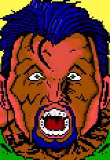
The Knight/Fuel (Fluph)
Step 1:
yo, the knight talking here ....
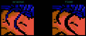
this is the basic version i recieved from this ansi... i'll take you through my "fixing process" in different steps, so you should be able to follow more or less what i did...
i didn't save the ansi each time i changed something, so there might be some flaws in it.. i'm sorry for that inconvenience..
 |
|
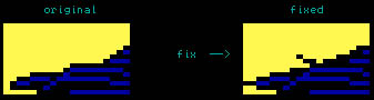
Step 2:
i outlined the hair on top to make the shadow look thicker, it creates a larger contrast with the background.. this also leaves you more room to let the hair sorta "flow" into the background. you can do this by just adding a little black space into the background.
|
eg:
Step 2b: i removed the awkward yellow glow on the right side of the face. if you want to highlight areas where the lightsource comes from, you can add little shadeblocks to it, but if you use full colored blocks, the result will most of the time look pretty crappy (unless when you're doing real toons)
Step 2c: reshaped the round size of the head at the top right, because if the hair falls over that area, it can't possibly recieve as much light there as in the lower areas... what's more, it adds confusion because it's the same color as the backround..
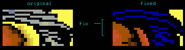
Step 2d: by this time you will also have noticed that i totally removed the light grey glow on the hair at the left side..
again, if you want to add highlight to that area, don't change the color too abruptly... you can for instance change the color from dark blue to light blue, but changing it from dk/blue to lt/grey is a bit heavy :) i think this is pretty easy to understand, if not, let me spell it out for you :)

ps: it's not really "impossible" to use socalled unmixable colors, but i guess your name has to be dieznyik, flame or ville to actually do it with "grace" :)... i'm just saying... if you do it at ONE point in your picture, you better go all the way with the wacky color- combinations..
Step 2e: what else did i change at this stage ... ah yes.. notice how i made the left side of the face a bit thinner... i dunno why i really did this, it kinda looked better i guess...
Step 2f: another quite difficult thing is drawing hair "over" a face. in this particular ansi, the drawer tried to grasp the image as "true" as possible by adding the haircolor into the black spaces.. look down for example. this is how any normal guy would do it :).. but you must remember that you are dealing with ansi, so you don't have a whole lot of space :).. a better solution is to just leave the spaces black. and just let the mind do the work for you. take a look at the following fix.
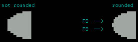
ps: also when you're using this technique, don't be afraid to make the strings of hair look thicker than they are on the original. it is much easier to let the hair bend and flow if it is thicker.. and oh yeah, do not forget to use the F7 and F8 keys to "round" off the shapes. not only for hairstuffs :)
Step 3a:
i'll start with the most obvious change, the eyes... eyes of your character are one of its main features.. bad eyes ruin your picture totally.. they are the essence (how subtle) of your character.. i made the eyecases (that english?) a lot bigger at first, so i would have more space to actually put in the eyes without having to cramm all of it into the tiny space.. don't be afraid to make them quite big.
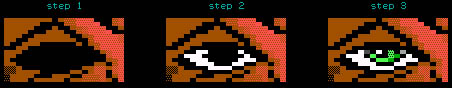
i: just fill it with black space at first...
ii: make sort of an eliptic form in white inside the black space, leaving only a round black space empty in the middle. try not not let the white area touch the rest of the (brown) face.
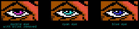
iii: now put in the eyecolor. don't forget to put in that certain "blink" into the eye. if you don't have space, start over again, coz this is what "does it" to the eye. if you leave it out, the eye will most probably suck bigtime.. i'll prove it to you .. and show you some different eyecolors while i'm at it..
Step 3b:
okay, onto the next change. i shaded the face darker than it originally was, mainly due to the fact that there couldn't possibly be so much highlight on top of the face (where the hair is implanted). this also made it much easier for me to let the hair flow over the face.
Step 3c:
another very important thing to watch out for is that you don't let full colored blocks of one color touch other full colored blocks. your ansi will look much better if you leave a tiny line of black space between different colors. i'm aware that this is not always possible, but you should do it as much as you can. it adds to the technical level of your ansi, aswel as to the visibility. i'll show you exactly what i mean.
in this particular case, i had no other option than to erase a lot of pink flesh color and make it browner.. if i would have made it pink it would seem too highlighted.
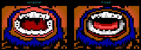
Step 3d:
also notice the different tongue i gave him.. the shading was a bit messy in the original so i decided to make it look more solid. also the lower teeth were changed here.. i'm still not happy with them at this stage, but we'll deal with that later..
 |
|
Step 4:
i changed the background from yellow to dk/grey for the obvious reason that yellow is a sucky color :).. no, this is ofcourse crap.. it just seemed to fit the picture better.. but i think backgrounds should have darker colors. that's maybe why you have FOREground and BACKground colors in the-acid-ice-cia-whatever-draw you're using.. (uh sorry if i left your drawing program out, i'm sure it rox)
|
Step 4b:
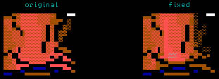
i gave the nose more highlighting by giving the left side a full upward line of pink. added two pink/ltgrey F1's to highlight the tip of the nose. rounded off the lower side of the nose with brown. and made the right side darker, coz that is the place where the shadow is most. rounding off with brown (or any dark color) is an easy technique you should remember. you can make stuff look more real with it.. i like to call it anti-aliasing, which means as much as letting your lightest color blend into the black space more.
Step 4c:
i did some fixups on the upper teeth too now. notice more or less the same "anti-aliassing" technique i used for this.. the white doesn't really clash with the black surrounding it, because i made the transition softer with the light grey, and even softened the lightgrey with darkgrey at some points. i did the same with the lower teeth coz like i said, i wasn't happy with the "fuzzyness" yet..
Step 4d:
i made the guy's neck stand out more clearly in this picture too, so you can make out where exactly the neck, clothes, and background are..
Step 4e:
i fucked around with his right ear at this point too, but not really happy with it yet.. we'll get to that later too :)..
Step 4f:
added some minor highlight at the righthand side of his jaw with pink/ltgrey too..
 |
|
Step 5:
FINISHED! |
The Tutorial was written by The Knight/Fuel
|