|
dangermouse -- Endor
Step 1 -- The Outline:
I find the easiest way to start a font outline, or any kind of original part of the ansi, is to just start drawing -- see what it comes out like, let your artistic side just come out..
Admittedly, some people choose to sketch out an outline on a piece of paper and work their way from there.. Just do whatever suits you.. I tend to use both methods, more so just fooling around.. (the header ansi testifies to that fact!)
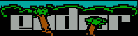
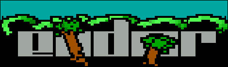
Below is a simple outline of ENDOR.. The method I've used here is to start with a blocky version of the font. If you get really stuck starting a font, this method makes it a bit easier.

Step 2:
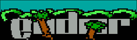
It is important to note that usually the best logos come from a theme. For this particular ansi, ENDOR, being an avid star wars fan, i chose to base the ansi on the ENDOR terrain as such: trees, greenery, etc..
From here i tend to just start touching up the font a little, not too much, and maybe start a few of the background elements..
My method of drawing is usually to just outline, and fill to begin with, as the below ansi shows, and later on worry about shading..
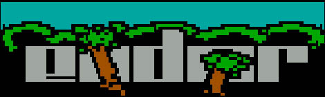
Step 3:
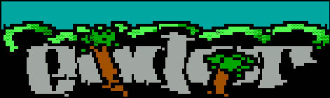
Now for some simple shading on the "tree like doobies".
It is important to note that you should usually always select a light source in this case mine is from the top left (as if a spot-light was sitting there). This makes an ansi look more 3-Dimensional, and more professional.. Usually ansi artists starting off tend to use random shading patterns, and this tends to look messy - so dont do this! :)
Step 4:
Now to start touching up the font.. Though the current font is quite *easy* to read, it doesn't really look good.. A more curved appearance looks much better..
Until you get something which looks like this.. This is pretty easy to do, basically you just fool around with F7's & F8's a bit, to achieve the more curved font..
Step 5 -- Finish it off:
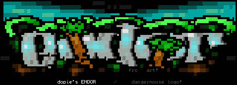
From here some artists will just finish the entire logo, as I have below.. However, please note that this is only one method of drawing a logo, this is nor correct or wrong..
Now we finish shading off the font, (using a light source), and add any background elements that have't already been added..
|