Drawing Lessons from Slothy - Medium Experienced to Advanced
I'm going to be using one of my earlier iCE ansis to point out common drawing errors that have taken me a long time to find solutions for in this beginning section.
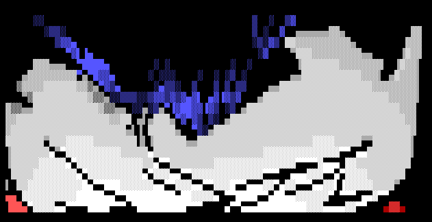
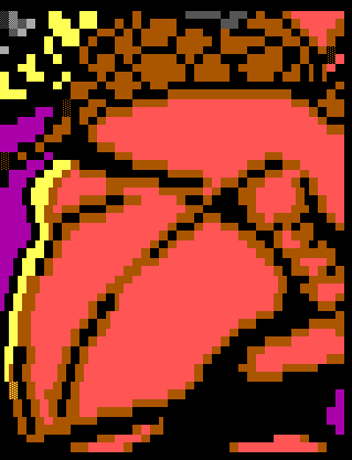
Here is the ansi we'll be working from:
Download the Original Article in ANSI Format
Now, besides the obvious 1993-1994 style of doing the stats and all that, this ansi is completely fault-ridden.
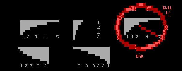
1. Lay out your entire ansi in block colors before shading
Start drawing your ansi with an outline and basic colors. Do not shade until a section is layed out completely. If you start from a point and start drawing the ansi as it will appear when you release it, you're just BEGGING for terrible proportion. I used to do exactly this.
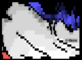
Here is a good selection:
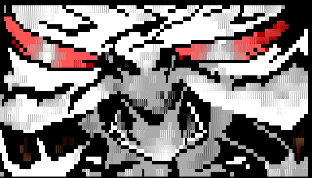
If you now notice, the guy's nose is now way to far to the right. Proportion problems aren't as apparent here as they are in many ansis I see, but thanks to VGA mode ansi viewing, this has dropped significantly since I first started drawing (September 1992 approx). This ansi was finished on January 31st, 1994, if you're wondering. But anyway, you'll notice that his whole face slides to the right as it progresses downwards.
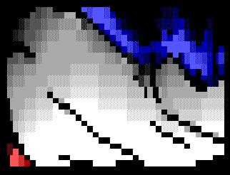
Also, in my opinion, an ansi should look great when it's completely unshaded. If it doesn't, it won't look all that much better after its shaded; you're only trying to mask basic problems.
Here, I'll include 2 quick clips from a joint ansi I did with Magnetic M last December.
Became:
Magnetic M and I are both stern believers that proportion is one of the most important things in an ansi. Don't discount yourself as not being a slave to the proportion monster, I could find bad proportions in any pack you can hand me. I have even found myself grudgingly erasing entire pages of ansi because the proportion problems are too complex to even fix; I have to draw the entire section over again to get it right. If your ansi doesn't look perfect without a single shaded block, it definately won't look perfect after it has been shaded. Laying out your ansi also becomes an integral part of shading for contrast, as discussed later.
2. Overshading
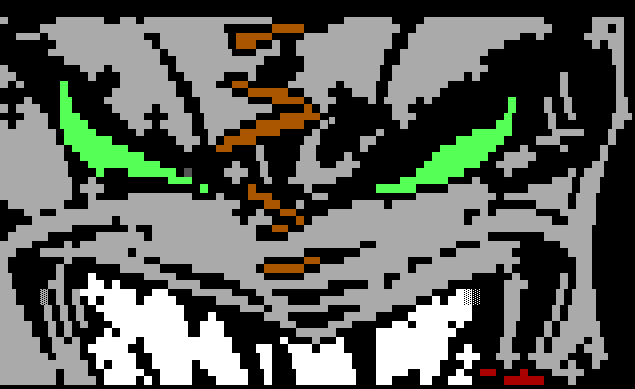
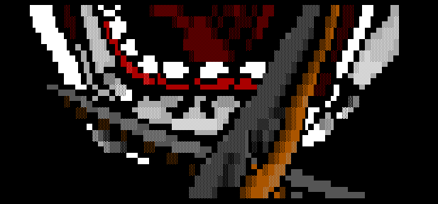
Once again we have something which is not a common sense answer to a problem. I have found my own personnal solution, which is shading for contrast. Shading in ansi should be short, smooth, and used only as a transition between two colors. Here is an example in that ansi where it is just excessively overshaded:
As you can see, I was thinking to myself "well, all his head is fairly light until it reaches his scalp. Therefore, I'll shade it slowly to color 7, medium grey." Additionally, to add to it, I was going through my overshaded phase where I though basic colors were evil, so I actually _SKIP_ basic color 7 with no shading blocks on it. I should have been gagged and flogged repeatedly. Just don't overshade folks, for me, please.
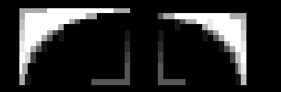
3. Continuing Half Blocks to meet shading
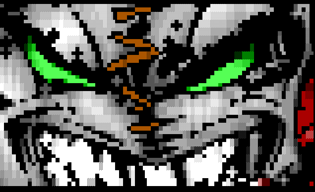
A COMMON thing I see is something I wrestled with for a long time. That is the dilemma of what color to make half-blocks (F5,F6,F7,F8) in the case of a shaded area. In the earlier version of the ansi below, you can see
I used some color 15 half-blocks around 15 on 7 F2's. Although this is a bright area, all this does is make the shading look disjointed, since it appears as if his face gets brighter at the edges of the shadows in his face. Keep in mind also that you're drawing the creases in his face, but really you're drawing the SHADOWS from those creases. In shading, you want to continue the shading trend of getting darker or lighter. Here are a few examples:

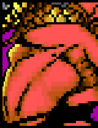
To pull back up the earlier piece, we'll look at a small selection and combine a lot of the things I've discussed so far.
|
Origionally Released
|
Redone 3/16/96
|
|
|
4. Trying for too much detail
This is something I've never seen mentioned before. The challenge of ansi is drawing in a restricted medium. Therefore, the ideal is to show a picture that doesn't look restricted at all. You have to find a balance
between simplicity and complexity. This has been one of the toughest
First off, let me go off about the claws. Besides the overshading, lets look at the effect we're trying to get. The claw has a bright light shining on it from one side, and a reflective glow from the other, or possibly a much weaker light source. The viewer has no clue how bright either light source is or where they're even coming from. If the claws were any thinner, I would either either get rid of the reflective glow altogether, or make it much less prominent. Next I want to discuss those gums :) Just because they're in the drawing doesn't mean you have to or even should include them. All they are here is clutter, since they are too thin to shade well, and would only look crappy as F1's or F2's, I should have left them out completely. The F1 Color 6's (brown) going up the length of the more horizontal claw just look shitty. The only colors that look decent in F1-F2's by themself are color 1,8 and sometimes 4. Next we have this guys tongue. The viewer is not going to know if the guy's tongue was visible in the picture you were drawing from, nor have any clue what it looked like. All it does here is clutter. Trying to add too much to a picture only detracts from it. My general rule is that if people aren't going to understand exactly what it is, leave it out, and if it's only going to distract from the main focal point(s), leave it out.
5. Shading for contrast
This is something I learned from Shaggy and got the necessary experience from working with Magnetic M to understand completely. In ansi, as I discussed earlier, the idea is that you're working with a limited medium.
When ansi first started, believe it or not, there was no "shaded style." Everything was toon, because it is the more natural thing to do with a limited number of colors. So, shading progressed, and we got what is called "Clean shading" or "oldschool," which I still think looks best :) Well, lets look at WHY we shade. Anyone who knows me knows I like to stop and try to figure out WHY we do things :). In its most simplistic form,
the idea is that we're showing areas that are bright and dark. In ansi, everything tends to blend together unless you exaggerate the bright and dark areas. I mean really exaggerate them. To do this well, you need to
really follow rule #1 completely. Then, when you go to shade, draw in the shading using only solid blocks, as if it were a toon.
Here's a pre and post-shading example on an ansi I did in January of a girl's torso.
|
Basic Shading Started
|
Finished version
|
|
|
By drawing in the colors in blocks first, you do a number of things. First off, you almost completely eliminate overshading. In doing this you are insuring the fact that you will be using the mid-tones (F1-F3) only as a
transition between colors. In fact, I mist say that my shading in the mid-abdomen section is pretty terrible, probably because I didn't lay it out in basic block colors with that indent intact.
The point in all this is that ansis need a large amount of contrast or they appear dull and boring. You really need to have colors jump out and have an equal amount of shadows and darkness. Backgrounds should always be
there, but should be just that. A background, that doesn't pull the viewer's eye away from the main attraction, but does provide a background environment so the pic doesn't look out of place. A good plan is to never
have a background that is a bright color like 7, and never have a background that is close in color to the foreground edges.
Now that you've drawn in the shading in a cartoon style, go back through and shade it fully, paying fine attention to detail. Since VGA viewers in drawing programs, people have paid less and less attention to detail.
Ansi was made for textmode, so draw it for textmode :) The whole reason why we did it in cartoon style first was to increase the bright areas of a pic. Had you just gone through and shaded it as many artists do, you
end up using a lot more F1-F3's and it ends up looking overshaded and bland, since it matches the base color more.
6. Cleanly adding slight hints of shading
Okay, now we're really getting into wierd topics. I'll discuss something I've picked up very recently. In shading, you sometimes want a color to drop off quickly, such as the shadows form his brow creases in his forehead. If the shadow had been larger, I would have used this method more. When shading down, you don't need to go through the entire order of shades, such as █▓▒░█▓▒░█▓▒░ or more crudely █▓▒░█▓▒░ or more recently █▓▒░█▓░▒▓▒░. Well, a good method that I stole from toon shading is to include half-blocks of a darker color on fairly light borders. You can also throw in some F1-F3's on horizontal block borders, but it's something that can be easily used too much.
Now you'll notice that I even added in two different shades of darker grey in the logo on the right. Now, that looks a bit too toony and the shading itself appears choppy, whereas we're looking for a more smooth look. Now we can go through and very dark shaded blocks, mostly F1, to the border.
Dark blues are probably my favoritist ansi color :)
The basic idea with this is to show shading, using high contrast, but keeping the shading to a minimal area. It's up to you how you do that, but it can really improve an ansi. Yes, I did change some of the basic outline here. So can you :)
7. Curves Lesson
Okay, this is a quick thing about drawing curves. Most people assume curves are one of the easier things in ansi. In doing curves, you want to be sure that the blocks follow a logical progression.
Here, have some pretty shaded curves that I drew thinking I'd be able to use them.
8. Basic proportions of the human body
Okay, I've been studying anatomy a bit, and here are some very basic human proportions to keep in mind when drawing anything resembling a
human being.
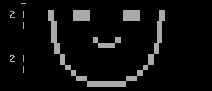
The Head
 The Human head is 3/2 as tall as it is wide. In other words, if it is 4 blocks wide it will be 3 blocks tall (since a vertical block is the size of 2 horizontal blocks) 3/2*4=6 half-blocks high = 3 blocks high The Human head is 3/2 as tall as it is wide. In other words, if it is 4 blocks wide it will be 3 blocks tall (since a vertical block is the size of 2 horizontal blocks) 3/2*4=6 half-blocks high = 3 blocks high
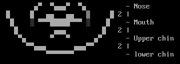
- The eyes on a human head are exactly HALFWAY down the head.
- The eye should be 1/5 the width of the head. In other words, the head is 5 eye-widths across.
- To find where the eyes should go, you only need to follow the angle from the tip of the nose to the nostrils on either side. That line will point to exactly where the eye should go.
|
This applies to the bottom 1/2 of the face, i.e. eyes to chin
- The nose ends exactly halfway.
- The nose is 1 eye-width wide.
Now, with the remaining 1/4 of the face, we're going to divide it into 3 parts.
|
|
|
- 1/3 down is the mouth
- 2/3 down is the upper chin
|
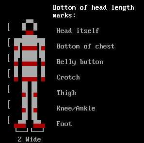
The Body
- The human body can be anywhere from 6-8 head-lengths long, about 7 for average people.
|
Don't use this if you don't want to, they really are the true proportions of the human body. If you want your person to look normal, he should follow these basic proportions.
|
|
That's all you get for now... I might do more tutorials and come out with more of these cool proportions for hands and things :) If this stuff interests you, get any and all art books by Burne Hogarth, that's where I got these from. I heartily recommend these books.
9. Picture Choice!
This really is the most important part of a good ansi. If you decide to draw an orange monster with brown hair and dark skin, don't expect people to really enjoy it much... (dark skin = color 6, brown hair = color 6, there is no color for orange except sometimes 12/6 or 12/4) If the picture is too much for you to handle and you know it, don't try it. However, I must encourage artists to try drawings from comics besides Gen 13, Spawn, etc, as although they have nice art, it's mostly subtle shading and well-proportioned bodies, which don't give you much of a chance to do detailed ansi. Look for detailed pics that will let you do some real detailed work, and not just some pic that is in front of you. Oh, just for everyone's knowledge, I DO NOT recommend drawing from your head. Don't expect yourself to be able to do it; people that can do it are called Professional Artists (normally :).
This is Lord Soth signing off... we'll have more tutorials on the way from various iCE Artists :) In the meantime, enjoy, keep drawing, and remember that you mother should not be the center of your sexual attention!
Slothy with the capital P. p.s. Happy birthday me!
Further Resources
|